Tuesday, June 4, 2013

Extending on my final Piece

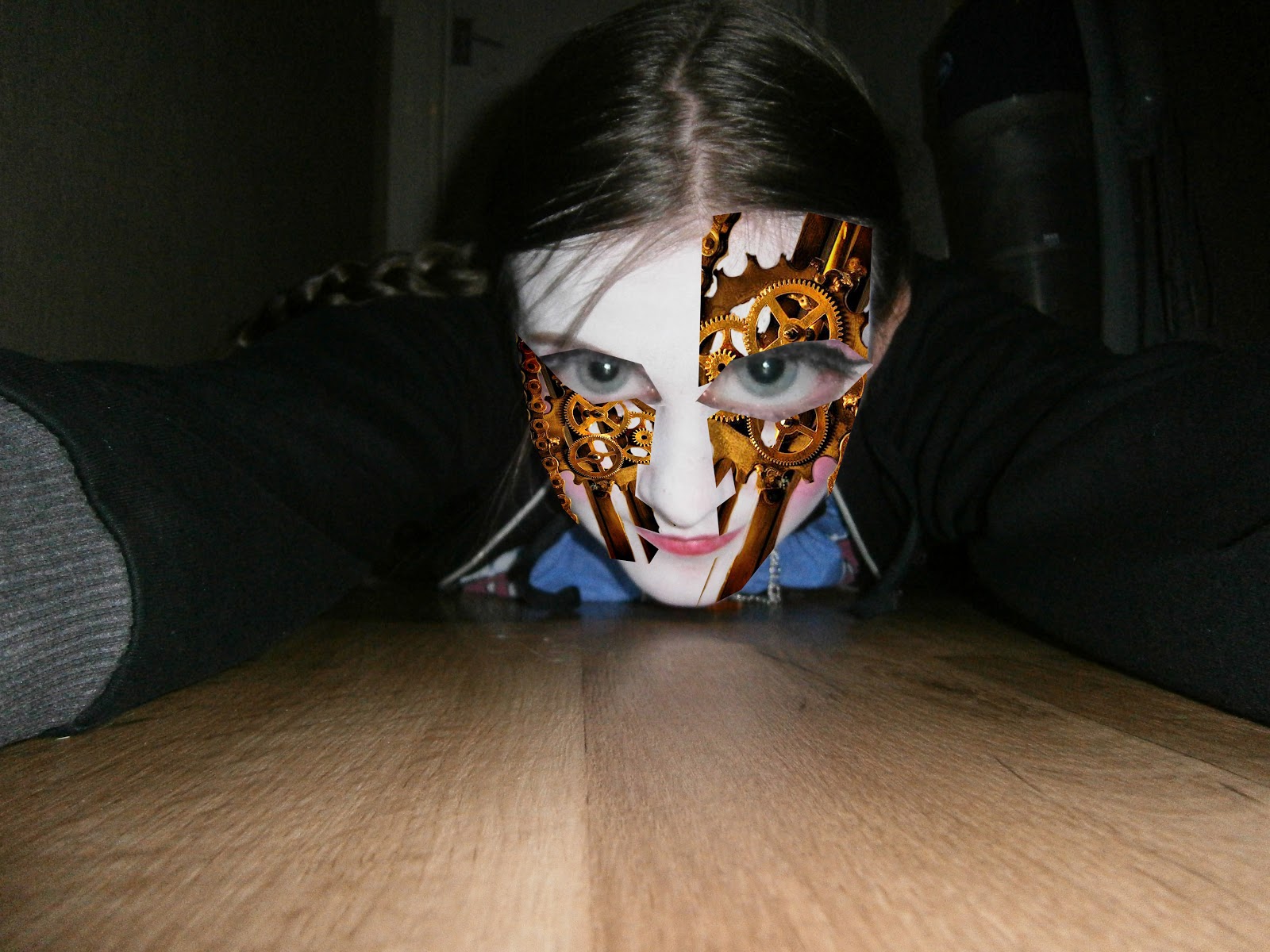
At this stage in the project I have completed my final designs and I am now in the part were I extend on my final piece. By doing this I am pushing my work further and thinking about ways in which my product would be successful if it was to go on sale for real. I think that I went for the obvious thing to start with: T-shirt designs. I used the main final piece and applied it to a simple T-shirt design. I think that these designs are successful because they are visually appealing and I think that the final outcome looks good.


Then I moved on to create some male designs because I don't want this production just to be for girls, I want it to appeal to all teenagers. I started with the simple design to show what it would look like on a different size T-shirt. Then I moved on to experimenting with colour, using various different photoshop tools to change the colour in a subtle but effective way. I like the different colours the photoshop tools create because they make them unique and they bring some more fantasy to my work, which is what I was aiming for.


Then I moved on to creating the tickets, which I feel are not as successful as everything else. They don't have the wow factor and flop in comparison to everything else. So to improve these I would have to experiment with different colour tools.

After the tickets I create backstage passes. I think they are better than the ticket design but still aren't as strong as the rest of the piece's I have created. I think what has made these two better is the tools that I used on photoshop.


After the backstage pass comes the VIP pass, I think these are the most successful out of the ticket range because they do have the wow factor, there full of colour and full of life. I don't think that these need improving but I could design a few more to create a collectors edition. To create the different colours I would have used either the Hue and Saturation tool or Curves tool, I think that these are very effective. When they are used on something like this they bring something new to the composition and they bring new colours in. 
Then I moved on to creating some Bag design which I think are every successful because they are all different designs but the same final piece is used in them. I think that one of the things I have learned from this part of the project is just how much you can use a design depending on its purpose. It has given me an insight on how I can use my work in lots of different ways. 


Here I have do some CD designs. I think that the final outcome is good because I have created three different designs, therefore everyone who purchases one won't always get the same cover.


Below is a CD case cover by this point I would say that my ideas were running out of steam, so it was quite difficult create the CD case. To create this I have to move the parts around seeing what looked best. Then experimented with colour, here again I feel that these designs aren't as strong or as successful as the whole thing. this is because to me it doesn't have the wow factor. I don't thing that experimenting with colour has helped either.


Lastly I created a DVD case, I think that the first one I ddi was a bit boring but when I started to change the colour it started to improve.

From this part of the project I have learned how simple things can alter the appearance of my work so much and how one piece of work can be change to create a whole direction of things to go with it. Also  when creating a publicity pack I could also create a collectors edition but I think is something I will have to use in projects in the future.


Wednesday, May 15, 2013

Design Ideas

Here I have started to work on my design Ideas for my final piece. I have experimented with different photoshop tools, layering techniques and typography. I have used my primary photographs to create them. The first design is completed, I have looked at Cliff Nielsen to inspire my work.


This is my second design idea. I experimented with primary images, Photoshop tools and layering techniques. I think that this is one of my strongest designs because it is the most eye-catching, the colours work well and it has been presented in a professional style.


This is my Third design idea. With this I also Experimented with primary images, Photoshop tools and layering techniques. I think that out of the three this isn't as strong because when you look at it, it doesn't have the wow factor that the others have. 


Wednesday, March 27, 2013

Final Major Project: Clockwork

Here I have posted a few experiments that I have done on photoshop in response to the theme of my project.


The last two are in response to an artist called Jesse Auersalo.
Experimenting with studio work.


These experiments were created using water-colour then I altered them on Photoshop. Using different backgrounds to create something interesting, Also I messed about with different blending tools.


Here I have started to develop my project further, going in the direction I wanted. For the piece below I tried to create a clockwork style face. I think that the final outcome is quite funky but a little bit on the weird side because of the colours and the way I have used photoshop to create it. 


This experiment is in response to the 1963 film: Modern times. I responded to this because I like the way they use the cogs to create the eyes. I also like the way the turned out, I think that this has been a good way for me to see how I can experiment with the placement of things in my work.  


With the two experiments above I have played around with scale and different ways to bring in the pieces of clockwork and machinary.


 These next four images are in respose to an artist called Cliff Nielsen. I originally found his work on a cover of a book I have read. I like the way his work has a fantasy quality and I would like my own work to have the same thing once I have completed my final piece. Below are a few Photoshop experiments I have done in the style of Cliff Nielsen.


Here I have started to experiment with my primary photographs and different Photoshop techniques.
The piece on the left was inspired by Robert Rauschenberg, I used similar techniques to create a background in the studio.  


 These are the same photograph but I have used different artistic tools on photoshop to make the changes. I like the differences between them because it shows a good contrast and what the whole piece looks like in a different colour.

Saturday, February 9, 2013

Marilyn Monroe

This is another Si Scott inspired piece and it is of Marilyn Monroe. It was created using fine liner. I put one of her famous quotes on 'Give a girl the right shoes, and she can conquer the world' because I felt it brought some of her personality to the image.

The Hatter

This is the Hatter from Tim Burtons Alice in wonderland, inspired by Si Scott. This piece was created at home using fine liner to add detail.

Thursday, February 7, 2013

Si Scott Inspired work

Another Si Scott inspired piece.

Si Scott inspired work

This piece was also inspired by Si Scott and in response to my primary photos.

Core work inspired by Si Scott

This piece was created by hand and it was inspired by Si Scott. I created it for my College Project: Rhymes re-visited, It is in response to my primary photos.

Wednesday, January 23, 2013

Logo Design

This is my final logo design for my Graphic's project: Branding and Advertising. To create this logo I used studio created work, Photoshop and Typography.

Mary Mary inspired Graphic's Work

This piece of work was created for my core project: Rhymes Re-visited. The rhyme that inspired this piece was 'Mary Mary'. I researched rebellious teenagers because I didn't want to do the typical little girl that always features in things that are related to this rhyme. I came across Japanese street fashion and that is what inspired the style of dress. To create the final piece I used a Graphics Tablet, Photoshop and two different pieces of studio created work.

Gemma Vanity, Final poster design

This is the design that I took forward as my final design because it looks amusing and it would get peoples attention if it was a real life performance. I used different fonts for my typography to set the mood of the music.

Gemma Vanity, Poster Design Idea

This is one of my design ideas that I created for my Graphics project: Publicity of a Performer. I used different primary photographs to create the background. Using photoshop tools I added the face of my performer.